Dr. Dos
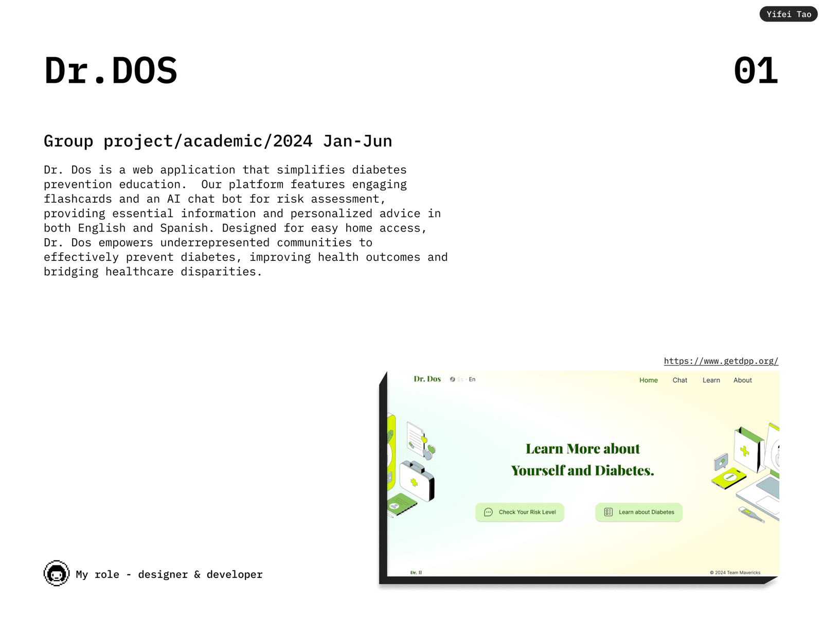
A bilingual web app that teaches diabetes prevention through flashcards and a chatbot that estimates your risk in about five minutes.
Type 2 diabetes is largely preventable. That is the whole reason a website can be worth building for it.
What it is
Dr. Dos is a web app that makes diabetes prevention education easy to get to. It has a set of flashcards that explain the basics, and an AI chatbot that walks you through a short risk assessment and gives you a personalised readout. Everything works in both English and Spanish.
Built between January and June 2024 by five students at the University of Washington Information School, sponsored by Frank Martinez of Last Myle LLC and made with the UW Latino Center for Health and Centro Cultural Mexicano. The name is Spanish for “Doctor Two”, after the type of diabetes it is about.
I worked as designer and developer.
Who it is for
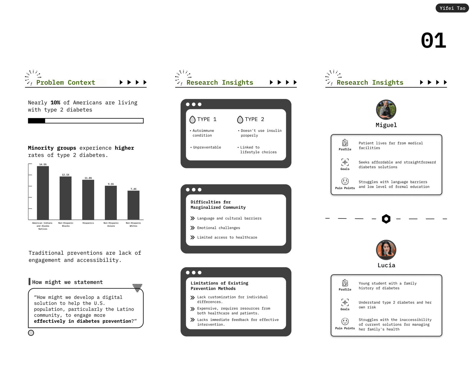
Around 10% of Americans live with type 2 diabetes, and the rate is higher in minority communities. It reaches 14.5% among American Indian and Alaska Native people, 12.1% among non-Hispanic Black people and 11.8% among Hispanic people, against 7.4% among non-Hispanic White people.
Existing prevention programmes are not built for those gaps. They tend to be expensive, they need time and resources from both the patient and a clinic, and they give you nothing back immediately. Add language and cultural barriers on top and the people at highest risk are the least served.
So the question we worked from was how to help the US population, and the Latino community in particular, engage with diabetes prevention more effectively.
What we built
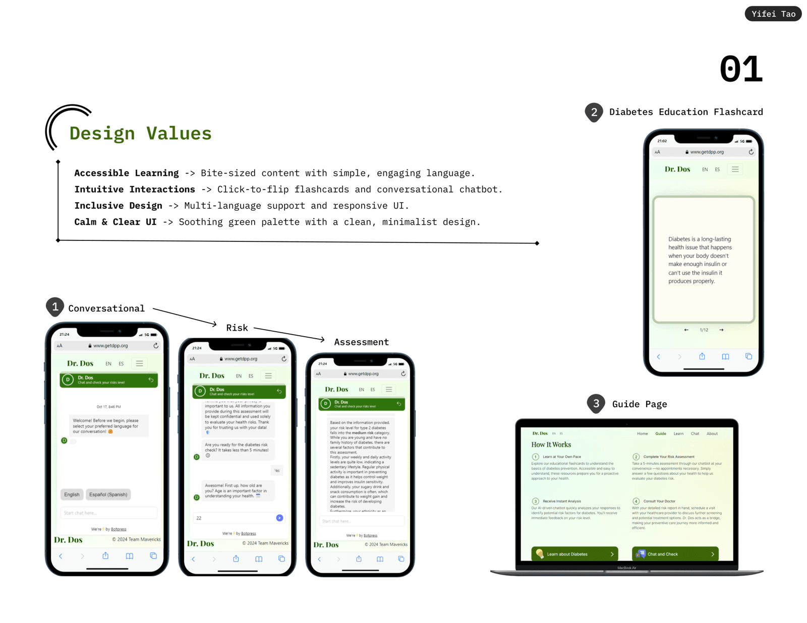
Three things, in the order someone would meet them.
The chatbot is the entry point. It asks your language first, then a handful of questions about age, activity, diet and background, and returns a risk category with the reasoning spelled out. It takes about five minutes and needs no appointment.
The flashcards are the slow lane. Twelve cards, click to flip, plain language, for anyone who wants to understand the condition rather than just their score.
The guide page ties the two together and ends by pointing you at a doctor, with your readout in hand.
Under it, the site is a React app. Language switching runs through i18next so both versions stay in step, the flashcards use react-quizlet-flashcard, and the assessment is a Botpress bot.