Interpretable AFib Detection
Wearable heart alerts frighten people because they arrive with no reason attached. This pipeline shows its evidence, and then measures how often the explanation lies.
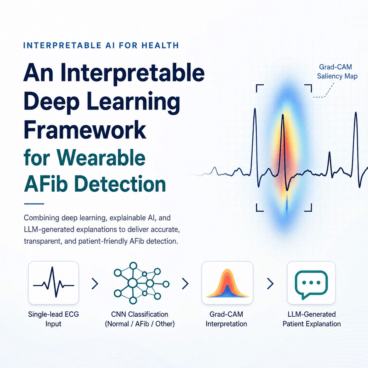
One patient took 916 smartwatch ECGs in a single year and made twelve unnecessary trips to the emergency department. The alerts were not lying to her. They just never said why.
The problem
Smartwatches are good at catching atrial fibrillation and bad at ruling it out. High sensitivity, low specificity, so a lot of people get flagged for rhythms that turn out to be benign, like the fast but regular heartbeat you get from caffeine or anxiety.
The damage is not really the wrong label. It is the silence around it. A watch says “possible AFib” or “inconclusive” and offers no reason, so the user has nothing to think with. A 2024 study of atrial fibrillation patients found that 20% of wearable users reported intense anxiety after a rhythm notification, and that this group went on to have twice the diagnostic tests and 4.5 times the ablation rate of matched non-users. Anxiety raises heart rate, a raised heart rate triggers more alerts, and the loop closes.
So the target of this project is not better accuracy. It is an output that can say what it saw.
The pipeline
A single-lead ECG goes into a small 1D CNN that sorts it into Normal, AFib, or Other. Grad-CAM then reads the last convolutional layer to produce a saliency map showing where along the waveform the model was actually looking.
That map is still a picture, so the next step turns it into words a person could act on. R-peaks are detected with NeuroKit2, and the saliency is averaged inside three physiological windows around each beat, the P-wave, the QRS complex and the T-wave, plus heart rate and the variability of the beat-to-beat intervals. Five numbers per recording.
Those numbers get bucketed into plain terms like “high” and “irregular” and handed to Claude, which writes the patient-facing explanation under strict rules. Describe only what is in the evidence, add nothing, do not tell the user they have or do not have a condition, always point them at a clinician. The language model never sees the raw signal, so writing the explanation becomes translation rather than diagnosis.
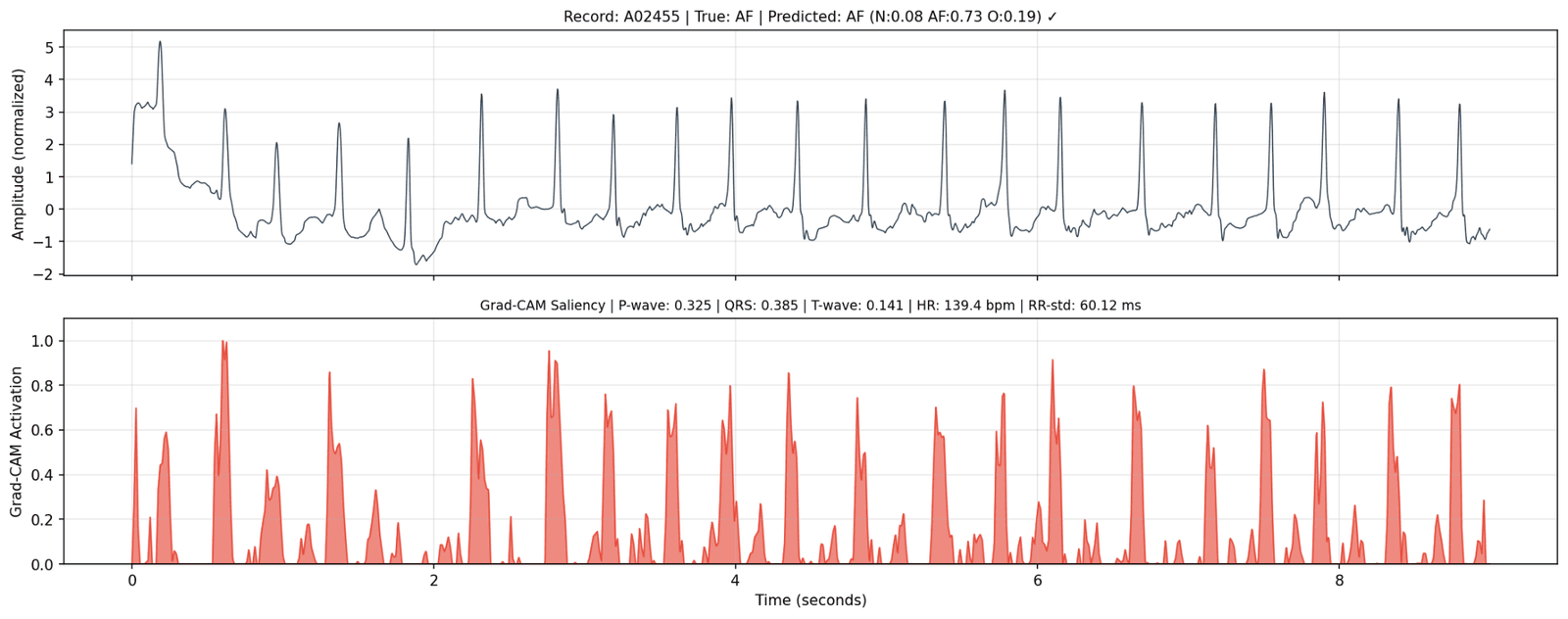
What the model was actually looking at
Averaged across the test set, AFib recordings had the highest QRS activation, 0.216 against 0.106 for Normal, and by far the highest beat-to-beat variability, 164 ms against 82 ms. That matches the clinical definition of AFib as an irregularly irregular rhythm, which is reassuring, because it suggests the network found the real signal rather than an artefact of the dataset.
P-wave activation was about the same across all three classes. In a single noisy lead, the model leans on rhythm rather than on P-wave shape.
The classifier itself is modest. 64% accuracy and a macro F1 of 0.53, strong on Normal and weak on AFib, which is what a 10 to 1 class imbalance does. Worth stating plainly, because the interesting result is downstream of it.
The finding
Forty explanations were annotated by hand against the evidence that produced them. An explanation counts as faithful only if it neither contradicts the evidence nor adds anything the evidence does not contain.
Overall, 72.5% were faithful. Split by class, that number falls apart. AFib explanations were faithful 94% of the time and Other 100%, but Normal only 29%.
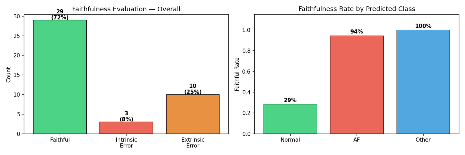
The reason is almost funny. On a Normal recording the model tends not to focus anywhere in particular, so all three activations come back low. The evidence effectively says nothing, and the language model, asked to explain something, filled the silence with plausible clinical description it had no basis for. Confident sentences about P-waves and T-waves looking exactly as expected, generated from an input that mentioned neither.
Give a language model nothing to stand on and it will invent a floor.
The fix
One rule added to the prompt. When all three activations are below 0.3, describe only heart rate and rhythm regularity and say nothing about wave morphology. Everything else in the pipeline was held fixed and the affected explanations were regenerated and re-annotated under the same protocol.
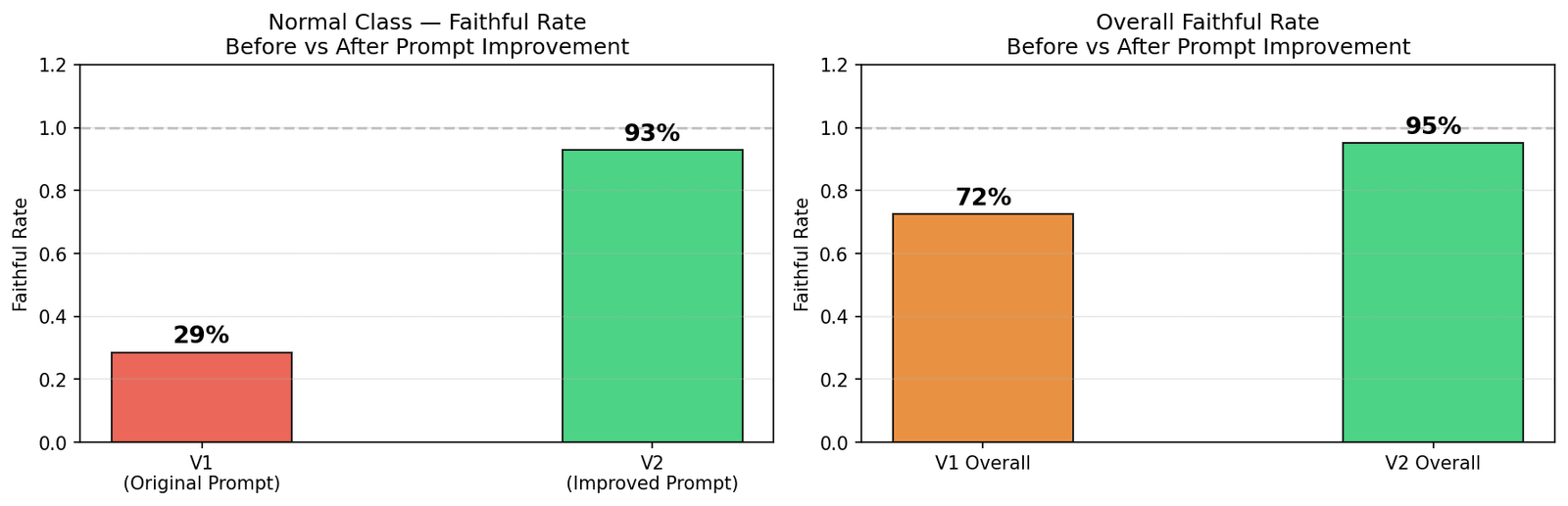
That gap was never a model problem. It was a prompt problem, and it was only visible because the explanations were checked line by line against the evidence. Standard text metrics like ROUGE would have scored the fabricated version perfectly well.
95% is not good enough to put in front of a patient. One explanation in twenty still contains a claim nothing supports, and an explanation can be perfectly faithful to the model’s evidence while the underlying classification is simply wrong. The honest summary is that grounding the text in structured evidence closes most of the gap, and that the last part is where the actual difficulty lives.